YesMilano
YesMilano is the official tourism and place-promotion brand of the city of Milan: a platform that showcases events, culture, lifestyle, business opportunities, and attractions, with the goal of telling Milan’s story to visitors, students, international talent, and investors.
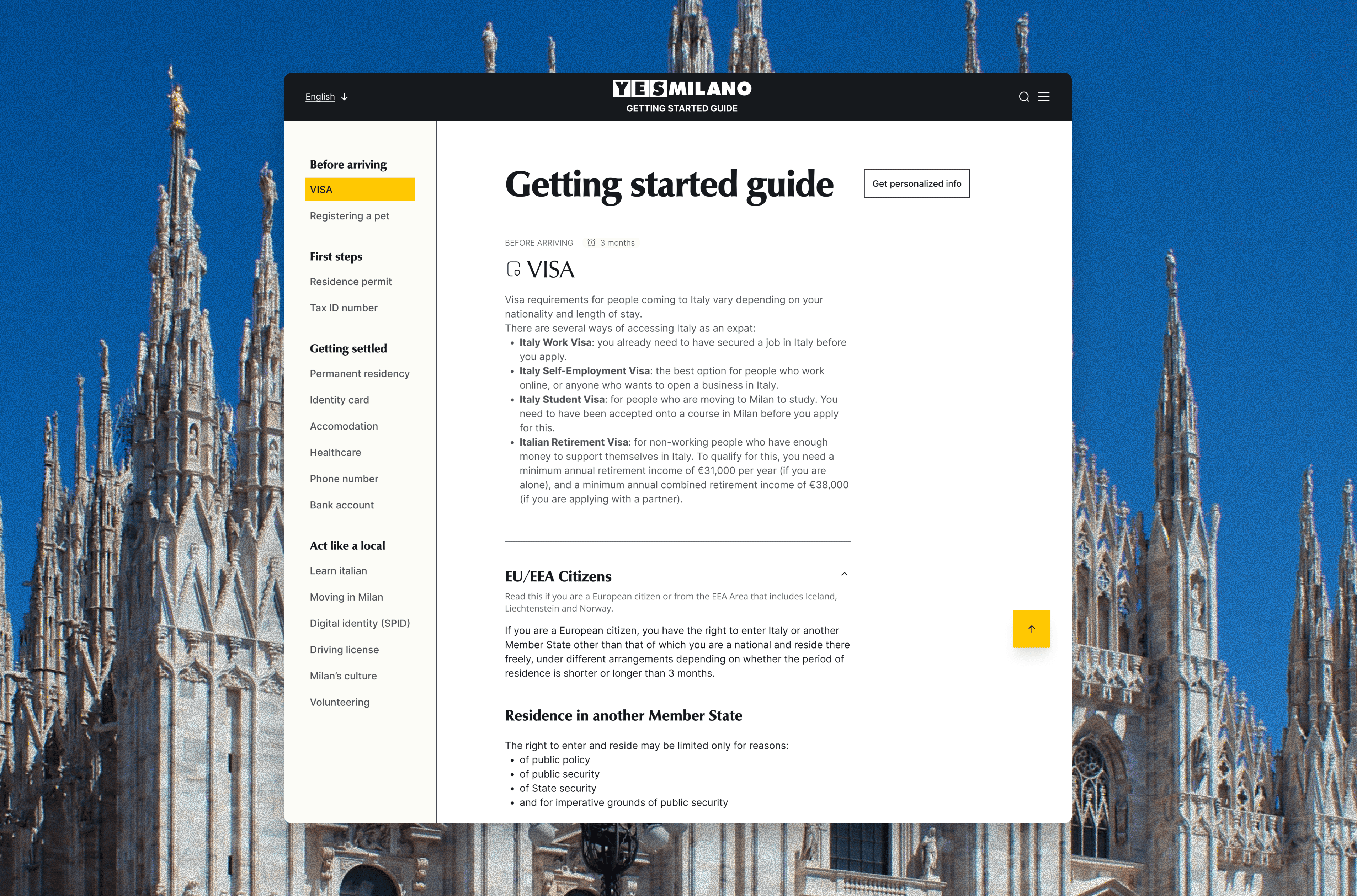
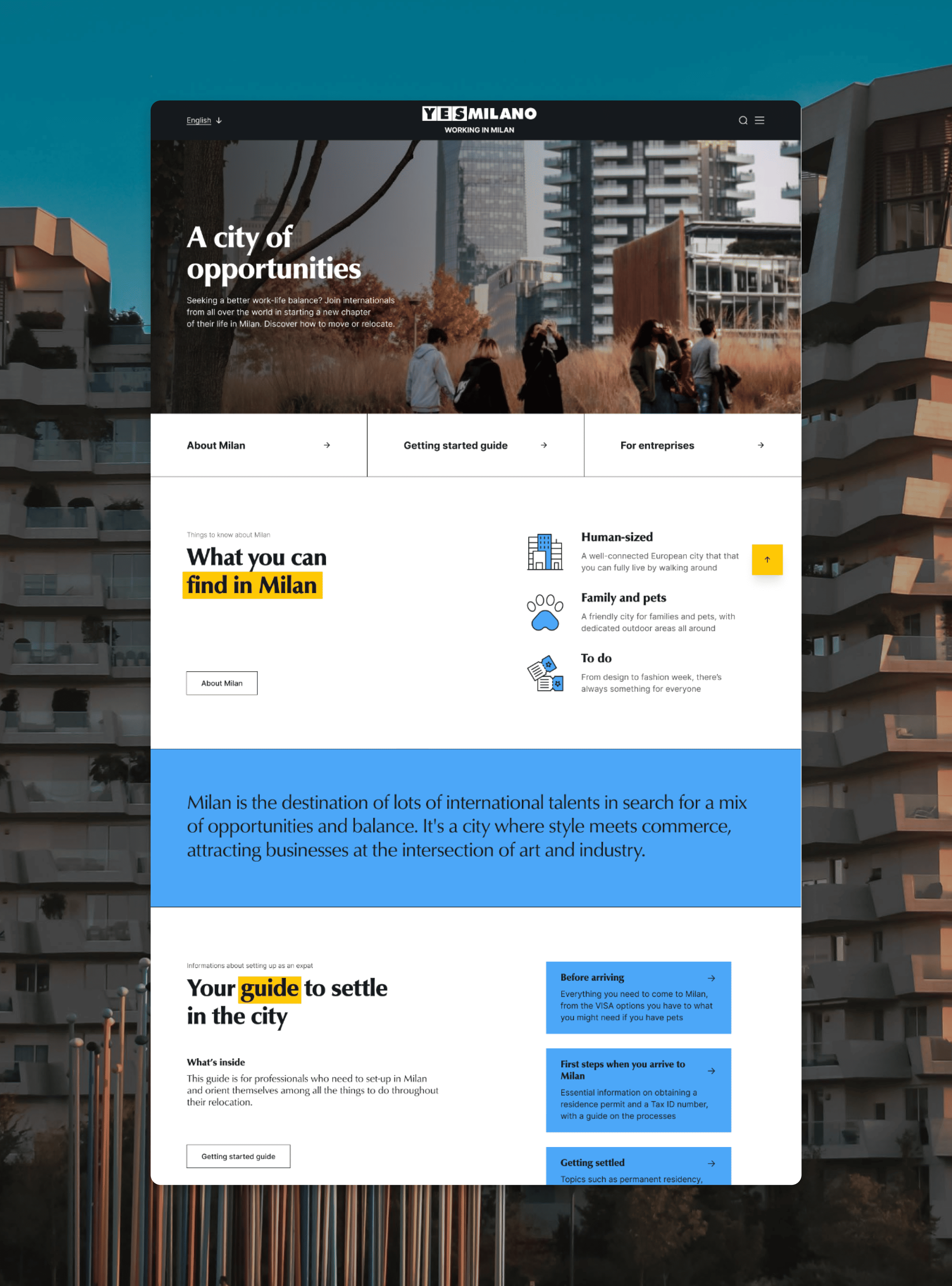
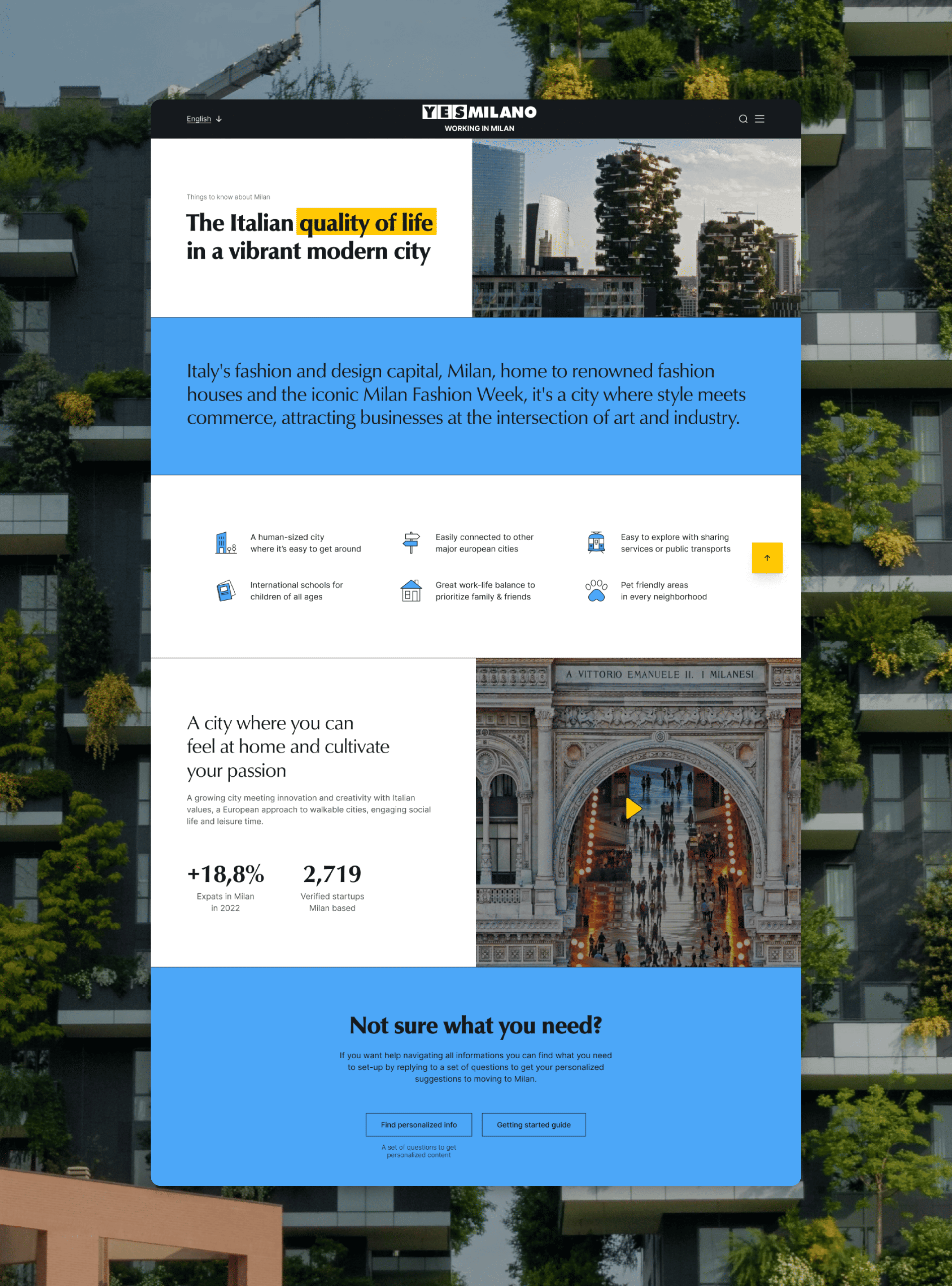
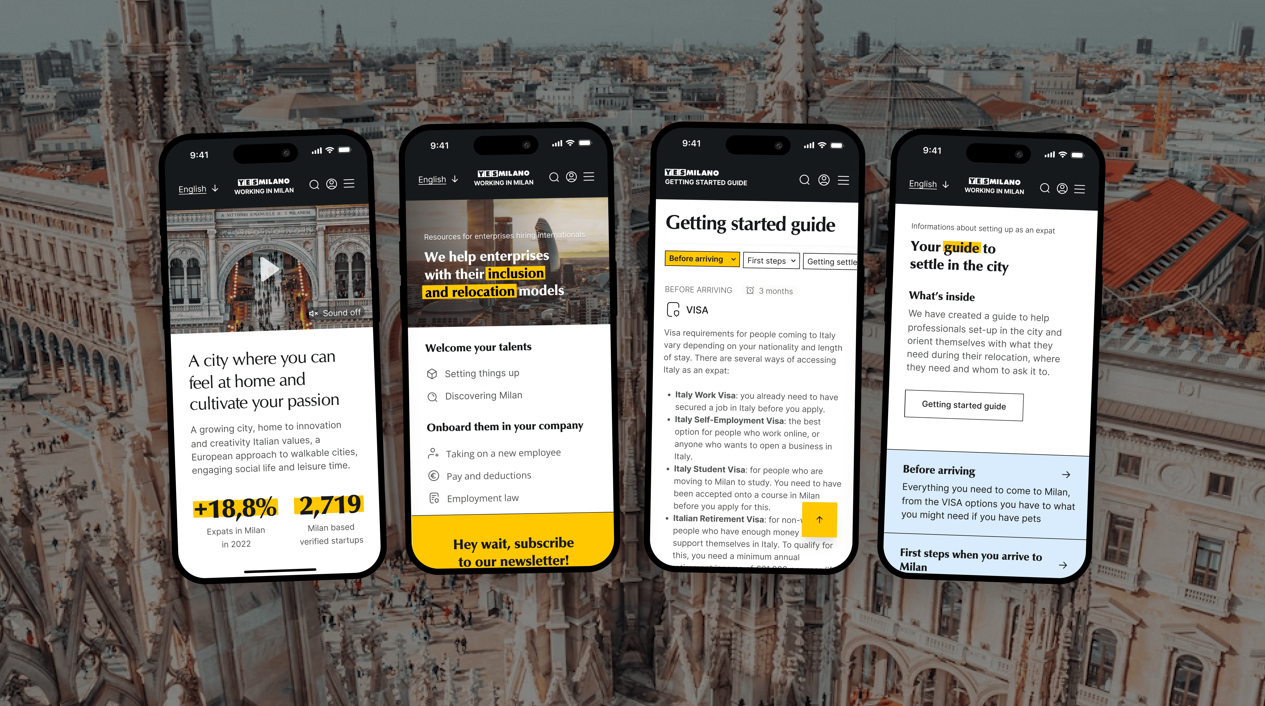
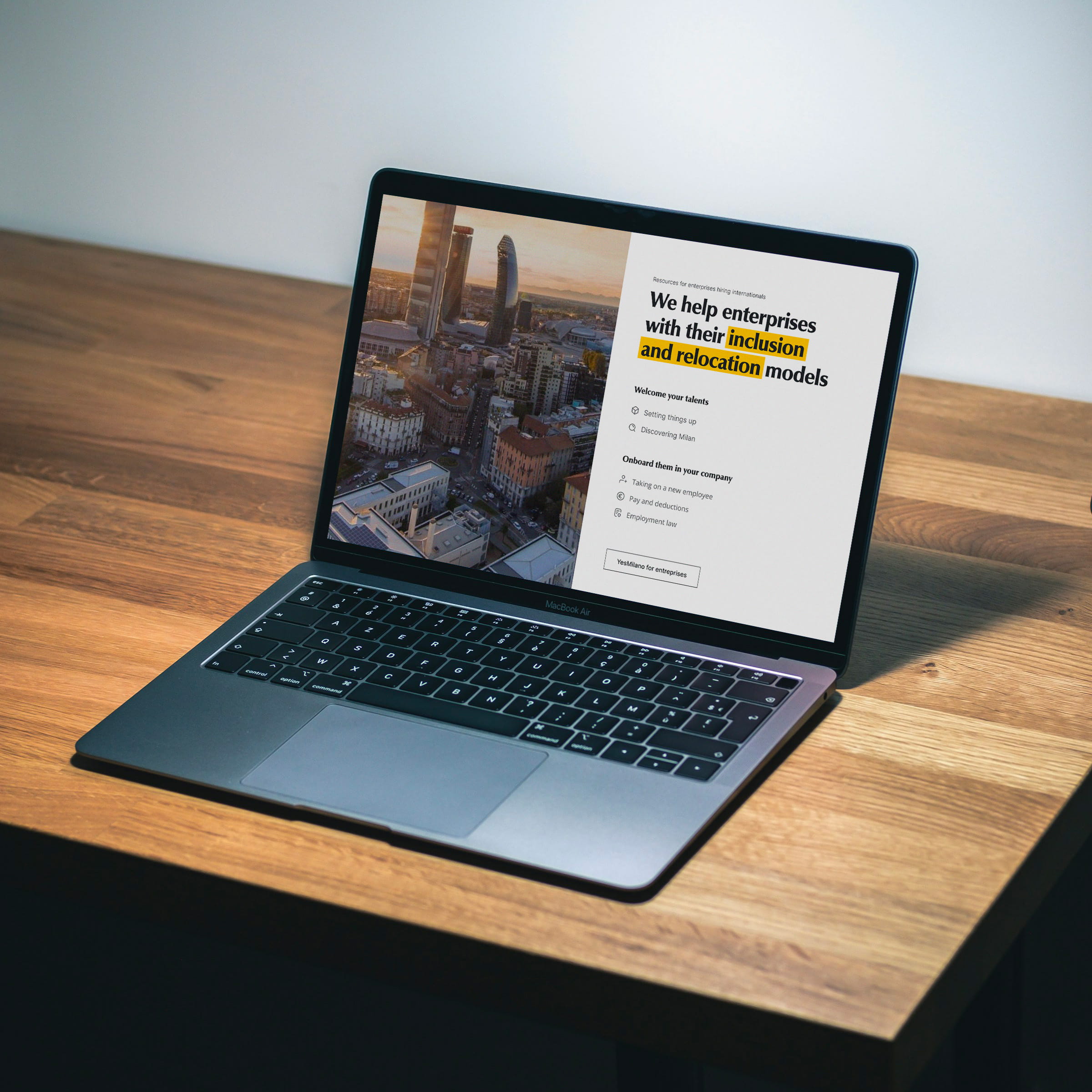
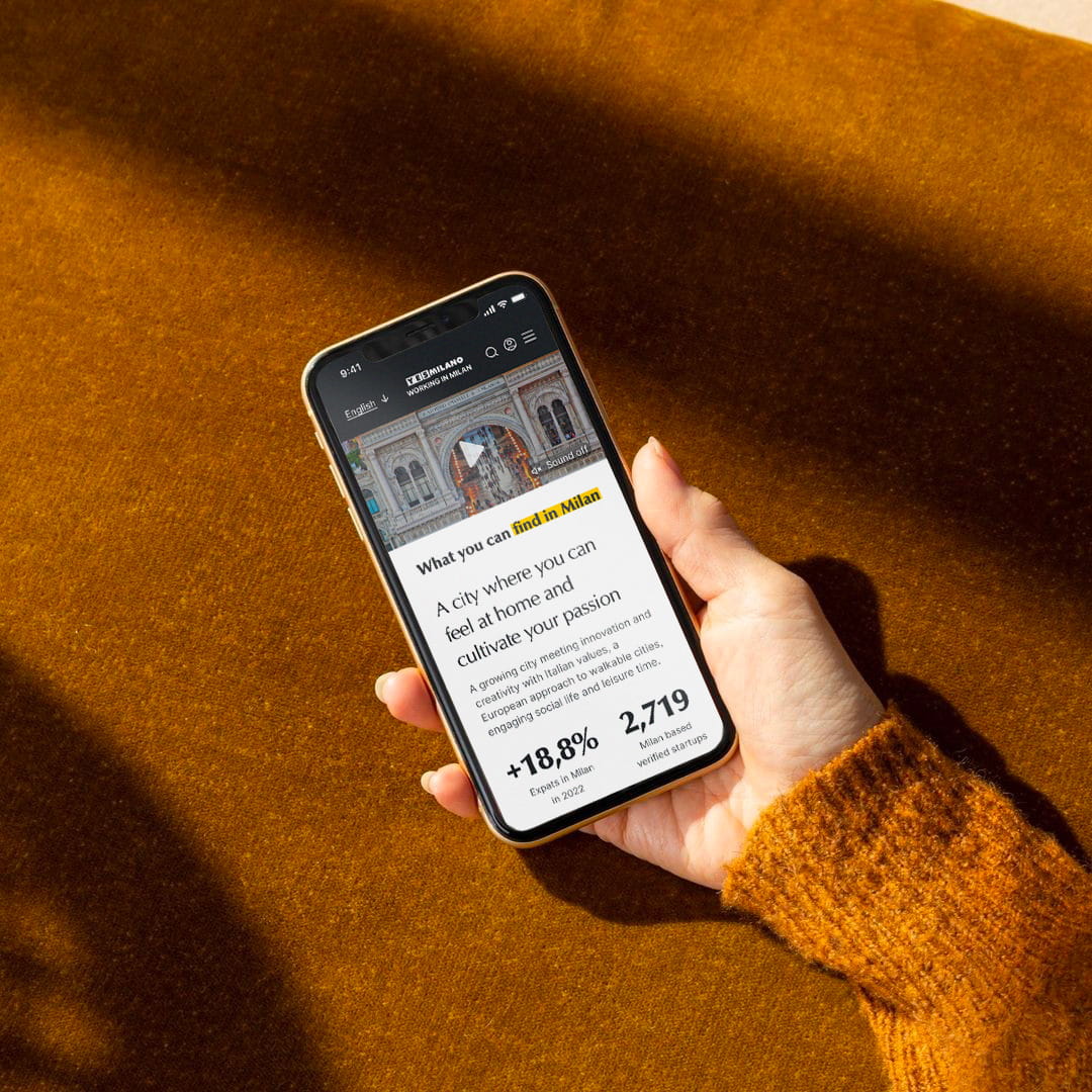
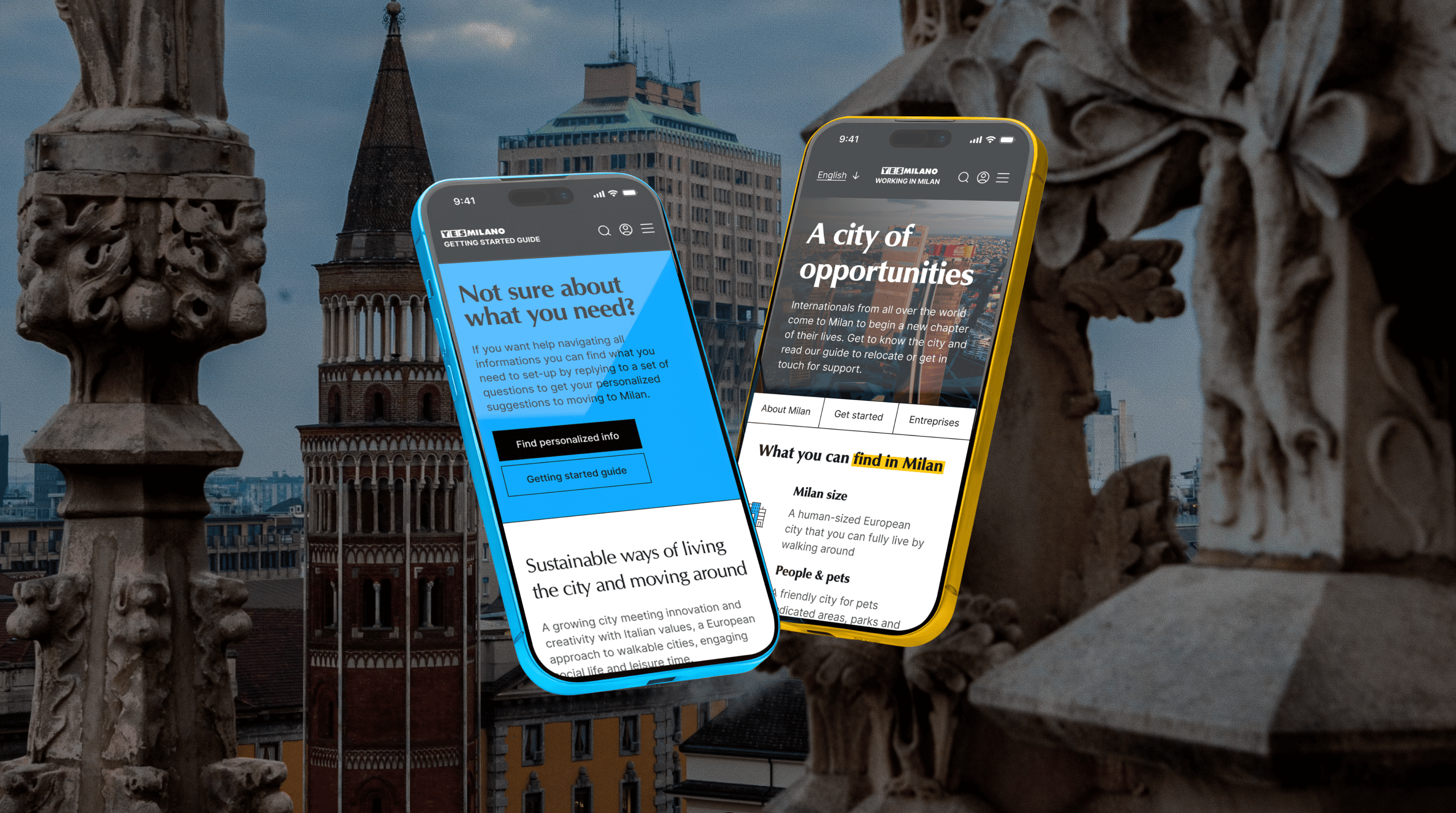
The YesMilano One Stop Shop is a single service desk (physical and digital) where international students and talents can complete multiple administrative procedures and receive practical support for settling into the city. We redesigned the OSS digital touchpoint, introducing new content and improving its user experience and visual language.
YEAR
2024
SECTOR
Public digital services
ROLE
UX/UI Designer

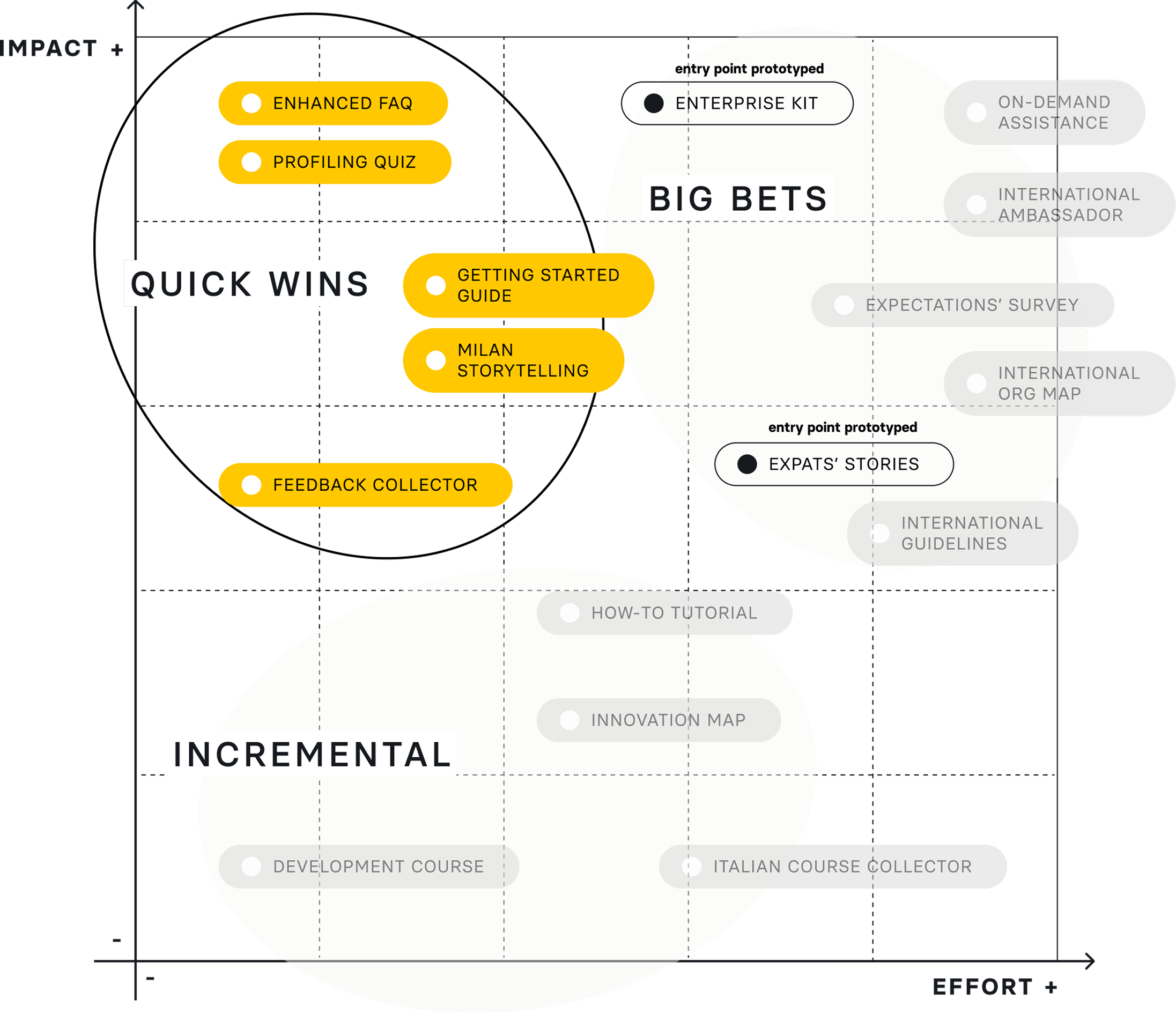
By synthesizing research and workshop insights, we identified concrete areas of opportunity for intervention. We mapped these to understand where meaningful change could be introduced, whether through new features, services, initiatives, or content.
Evaluating them through an effort–impact lens allowed us to prioritize initiatives with low implementation effort and high potential impact, which became the primary focus of the project.
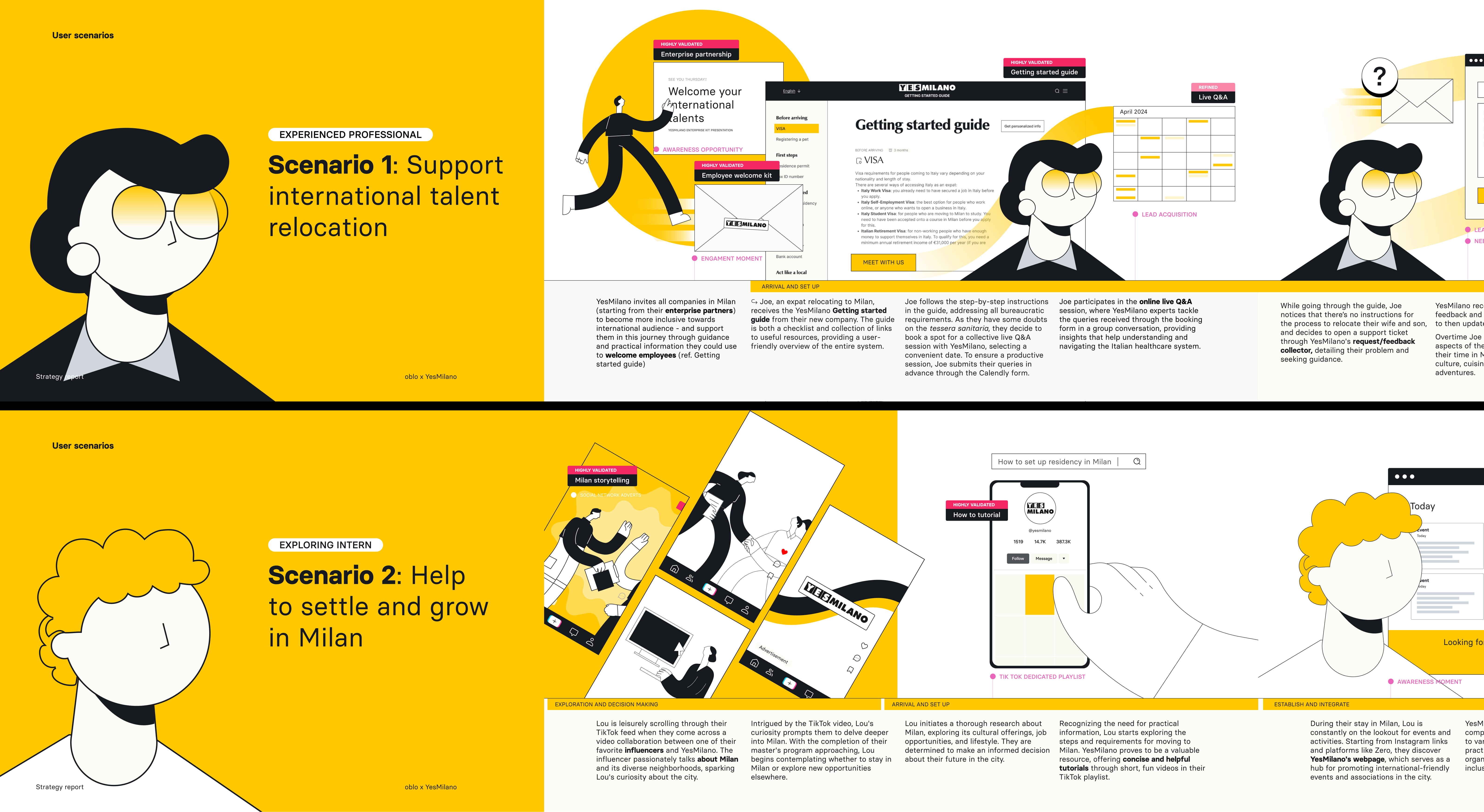
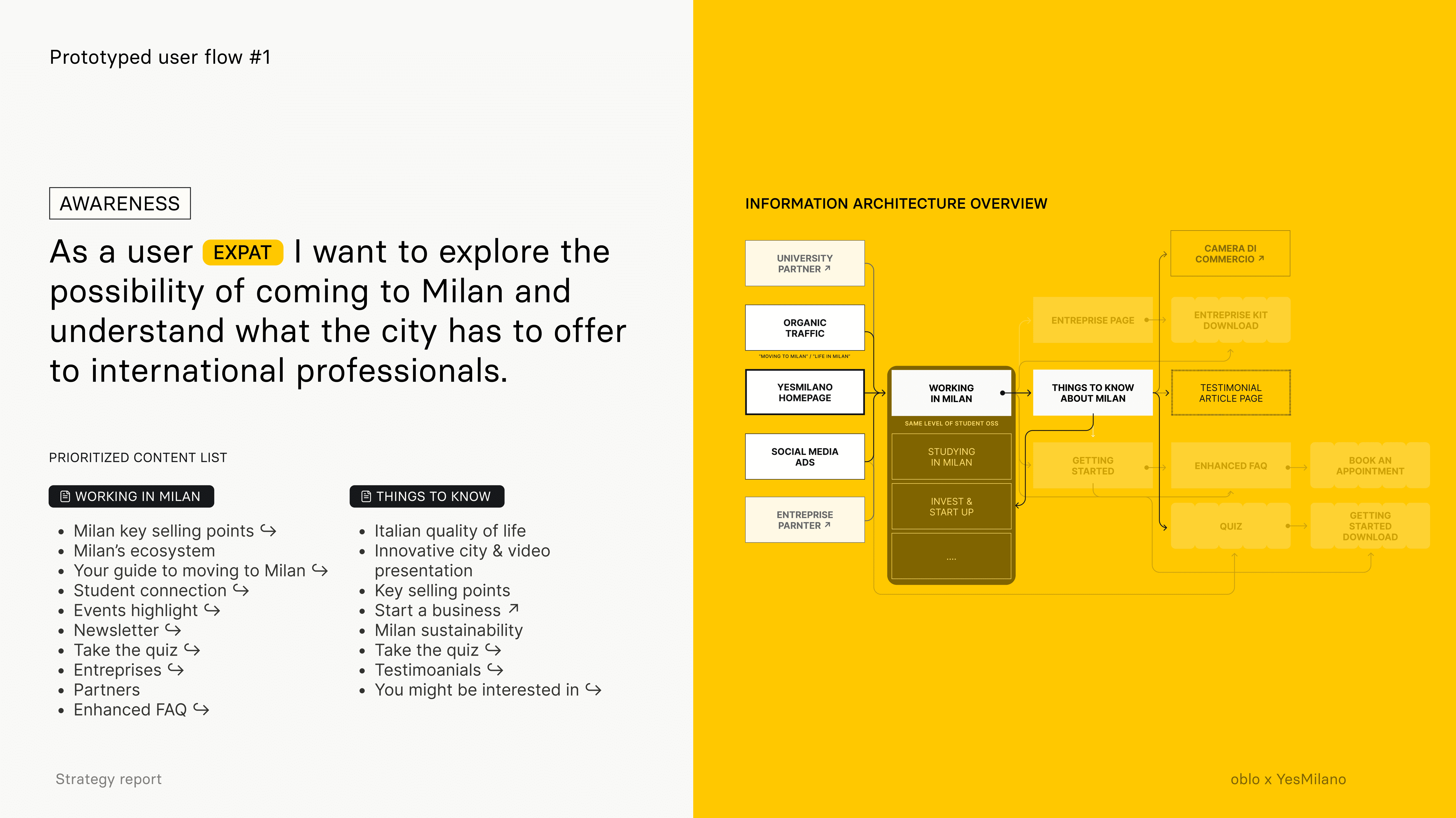
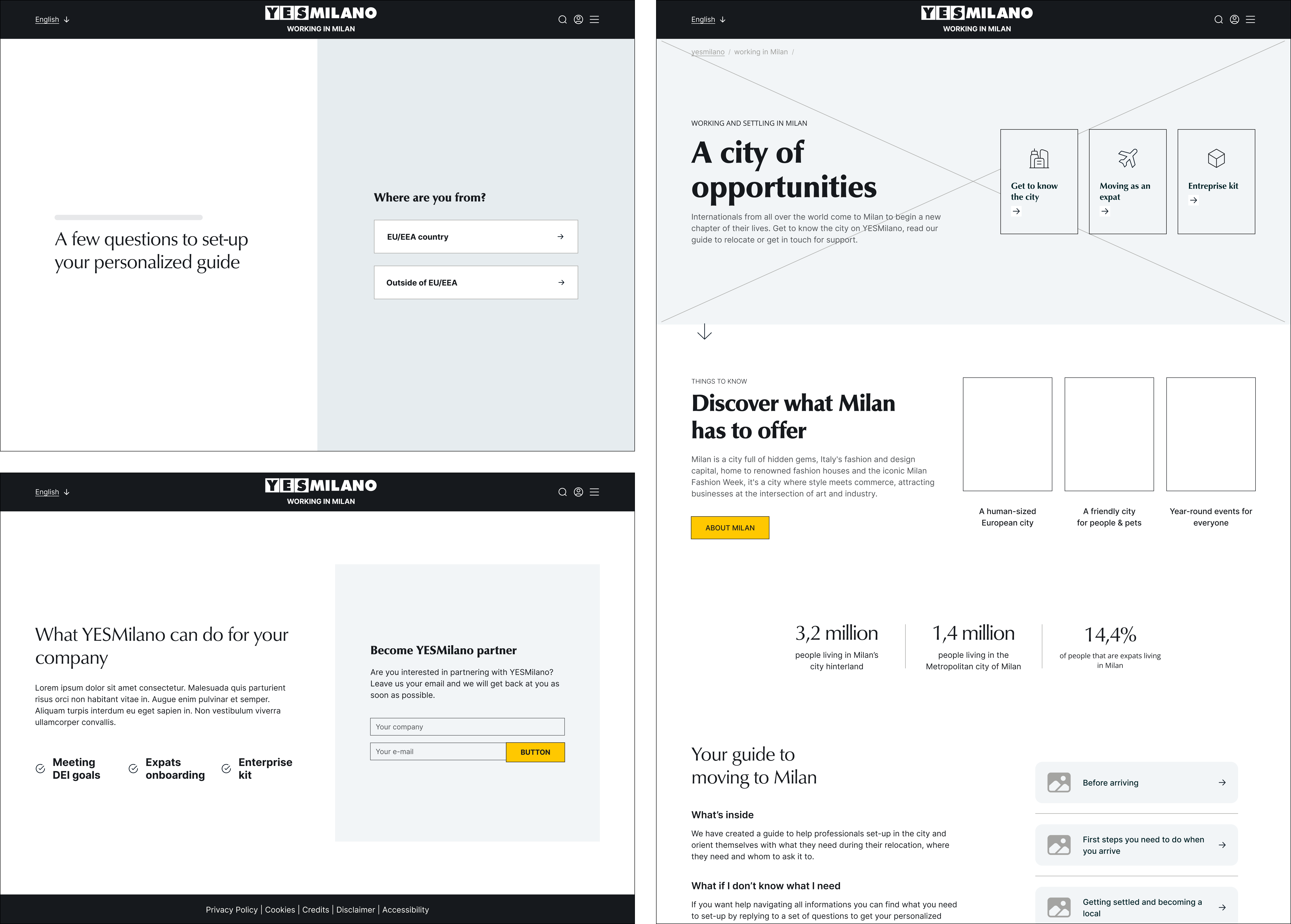
Starting from the user research insights, we defined three scenarios, representing the three main user clusters. From there, we mapped key user flows to structure interactions and identify the most effective paths for completing core actions. The flows then became the foundation for the wireframing and prototyping phases, guiding the interface design through a user-centered and task-oriented approach.
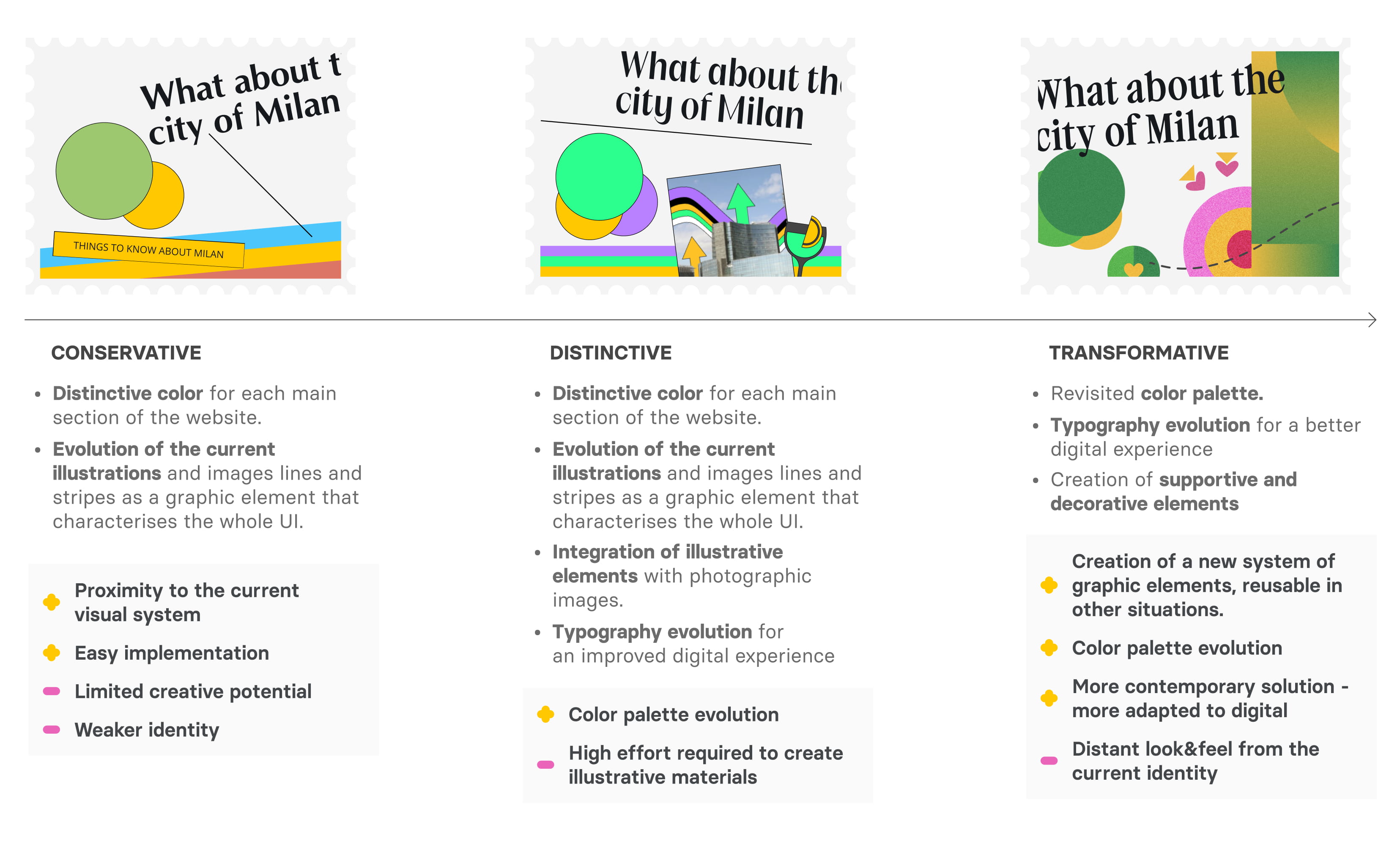
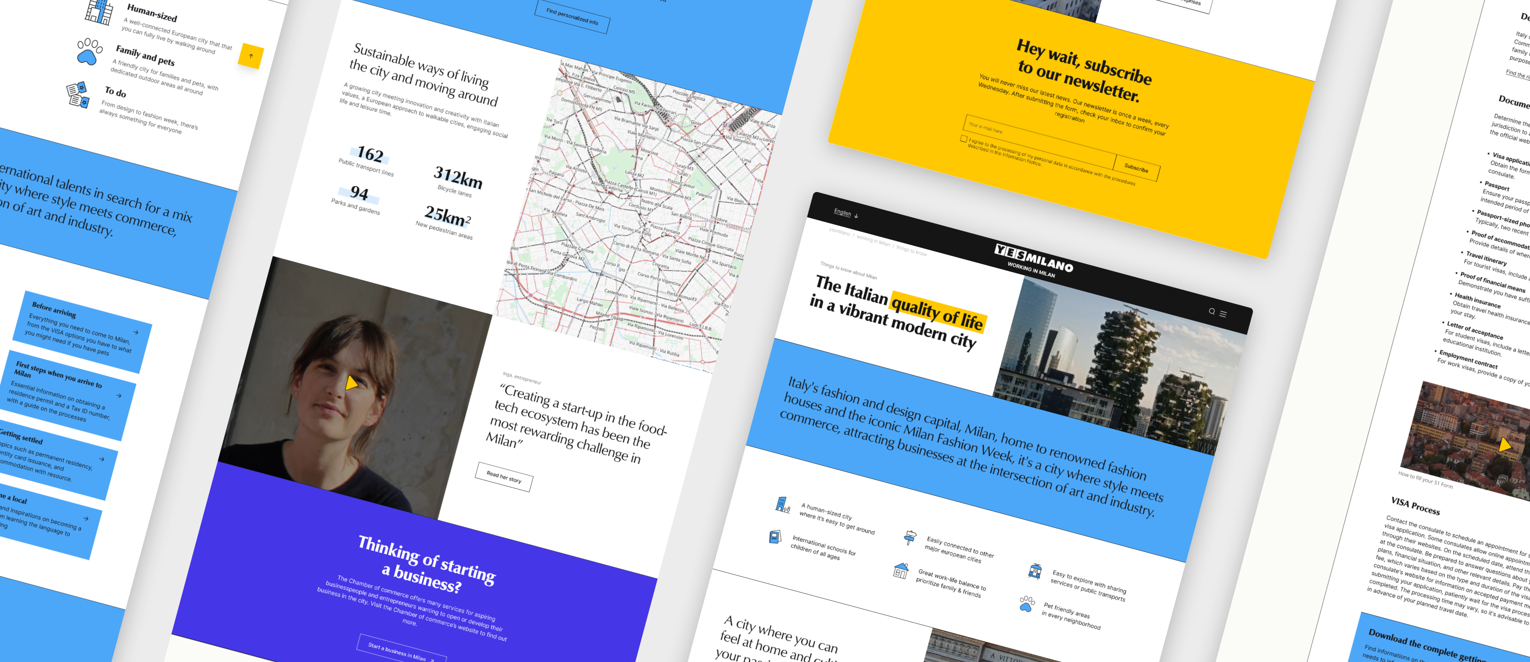
We developed 3 distinct UI directions for the platform experience:
→ a conservative approach, focused on refining and optimizing the existing visual language while improving clarity and usability
→ a distinctive approach, introducing an illustrative evolution to strengthen personality and engagement
→ a transformative approach, exploring a more radical departure from the original style, redefining how the service could be perceived and navigated.
The conservative direction was ultimately selected for further development, as it provided the most feasible path for implementation within the client’s technical capabilities and internal processes.
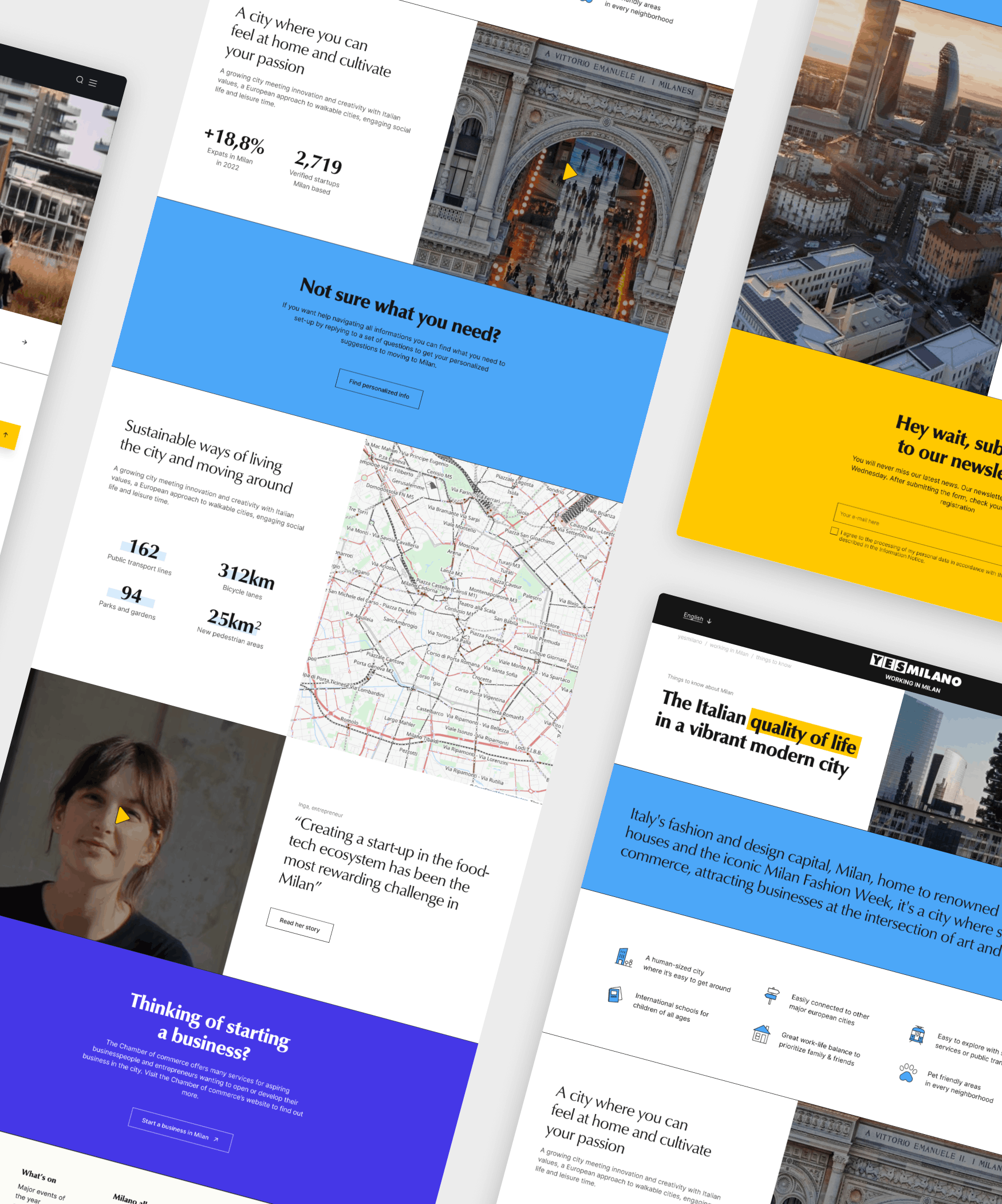